This rebuild is still fresh. For now, please only view the desktop version.
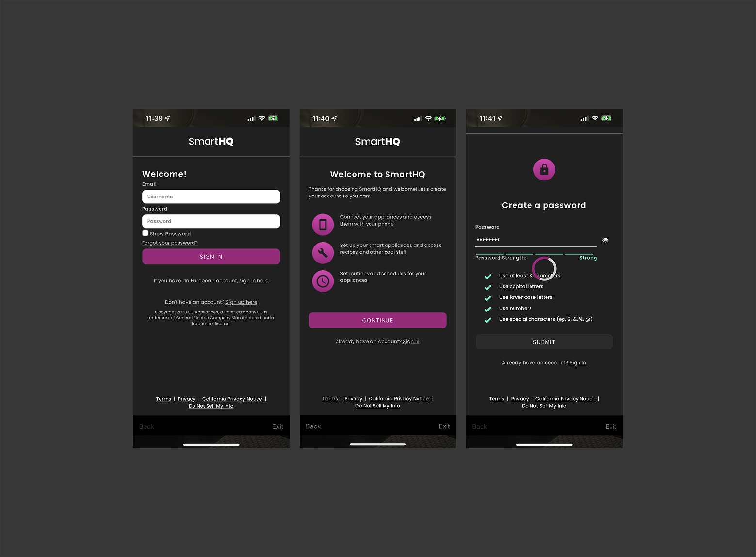
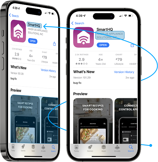
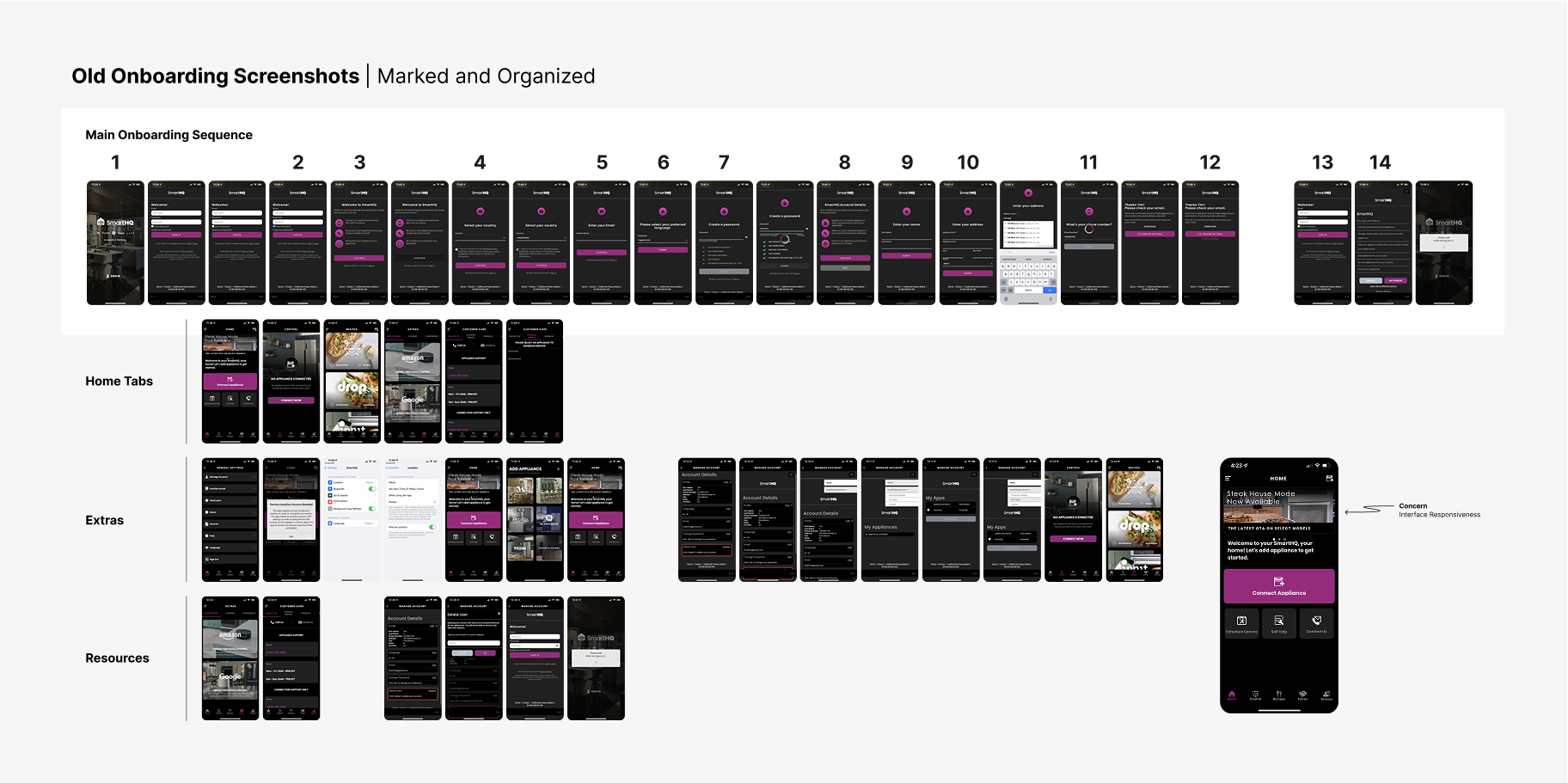
The existing onboarding flow reflected an MVP-era structure that had grown increasingly complex over time. New users were required to navigate a long sequence of screens with limited explanation, inconsistent hierarchy, and unclear intent, often before reaching the core app experience. Public app store reviews echoed these challenges, frequently referencing frustration and confusion during initial setup.
Key issues included:
- An overly long onboarding sequence that increased cognitive load.
- Required and optional inputs mixed together without sufficient context.
- Poor scannability caused by dense layouts and weak visual hierarchy.
- Accessibility issues related to color contrast and emphasis.
- Copy inconsistencies and misspellings that reduced credibility.
- Personal data requests introduced before establishing user trust or value.
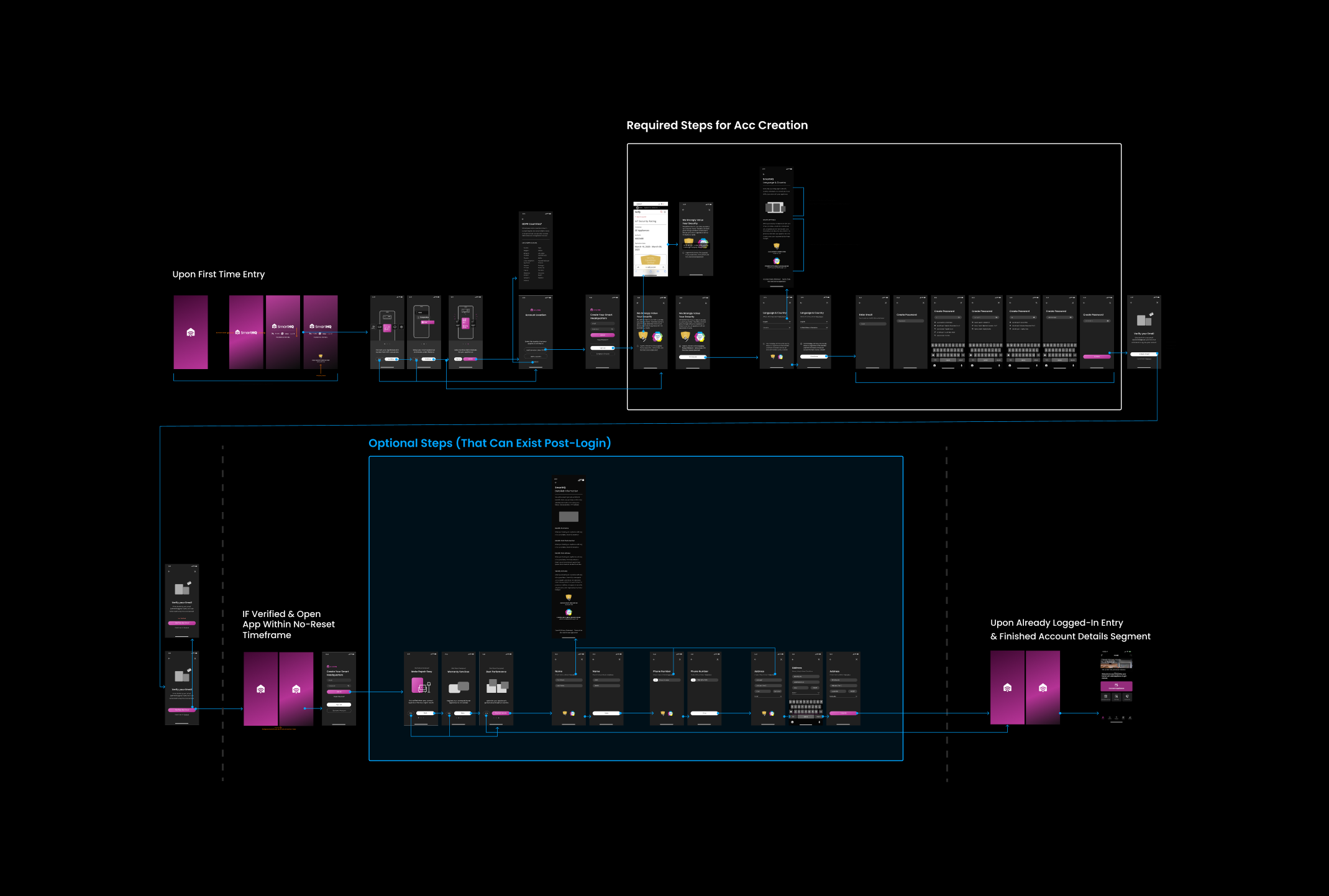
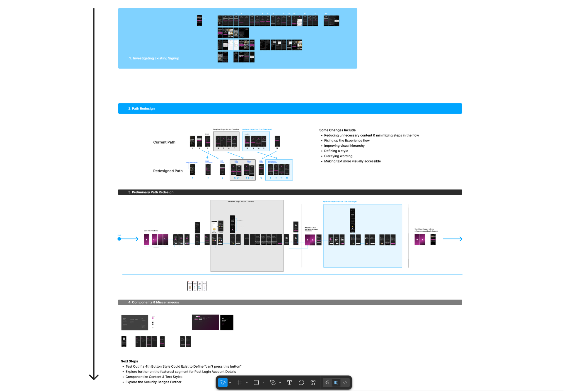
Rather than treating onboarding as a series of isolated UI screens, I approached it as a system-level experience that begins before a user ever opens the app. Early exploration focused on understanding how users discover SmartHQ, what language they associate with it, and how those expectations carry into first-time use. Given the scope of my role and the maturity of the platform, this work was positioned as a strategic proposal rather than a prescriptive mandate.
My approach emphasized:
- Evaluating onboarding as a complete journey rather than a linear checklist.
- Identifying structural friction points that compounded across the flow.
- Reframing onboarding around user intent instead of internal data priorities.
- Proposing incremental, low-risk structural improvements that could scale over time.
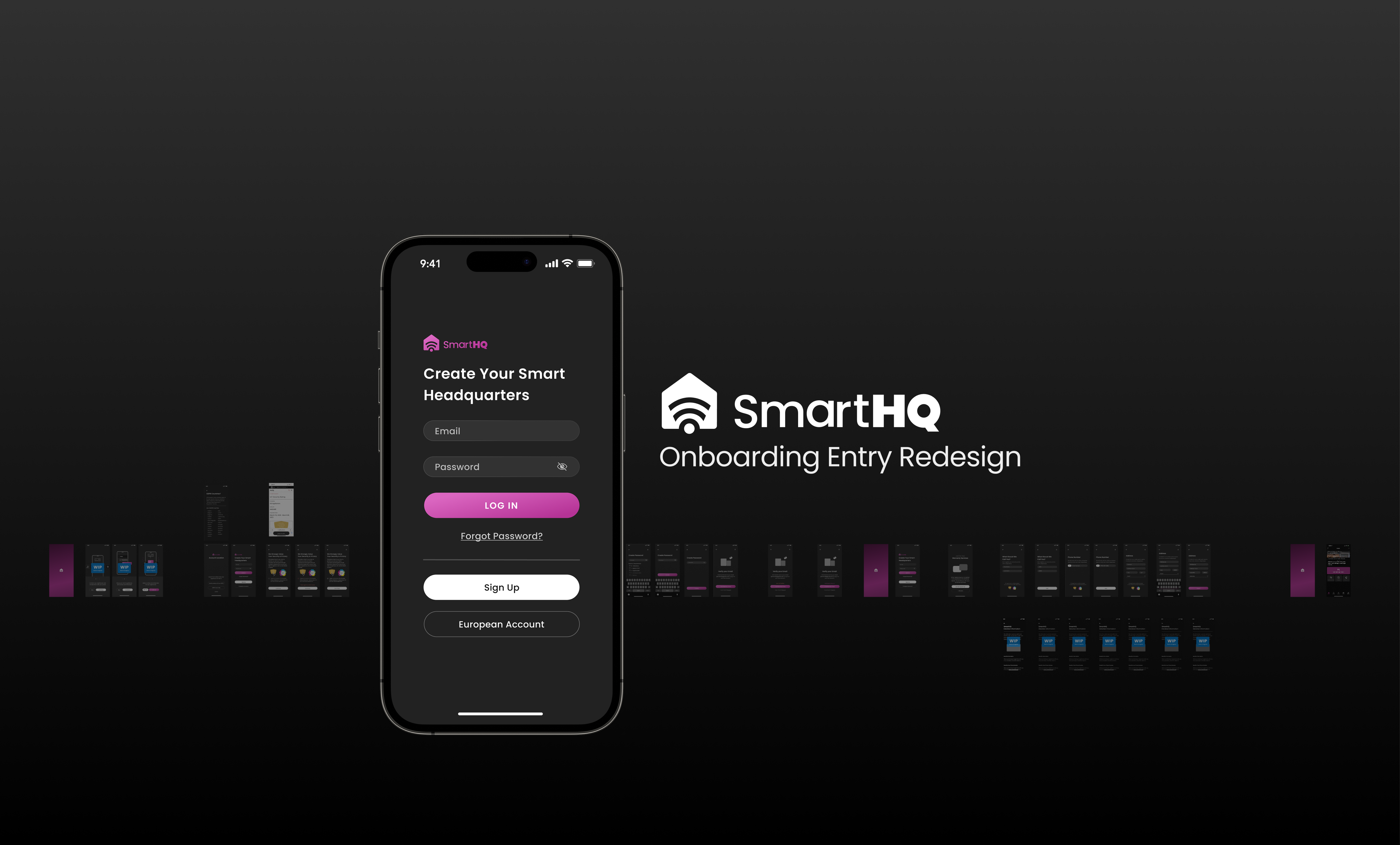
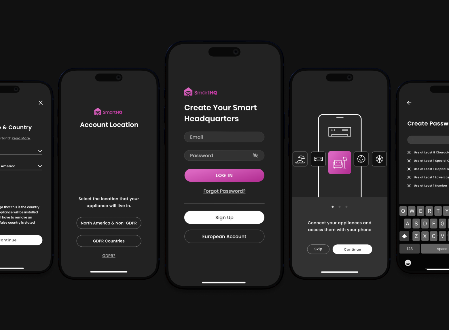
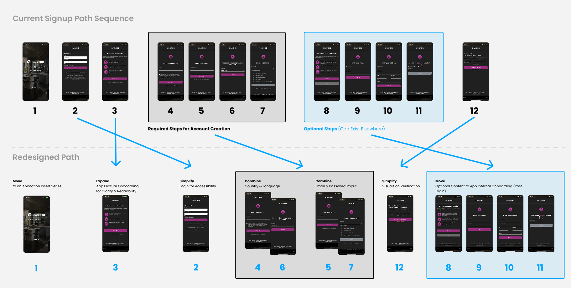
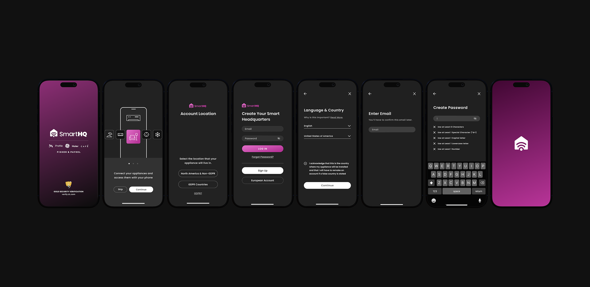
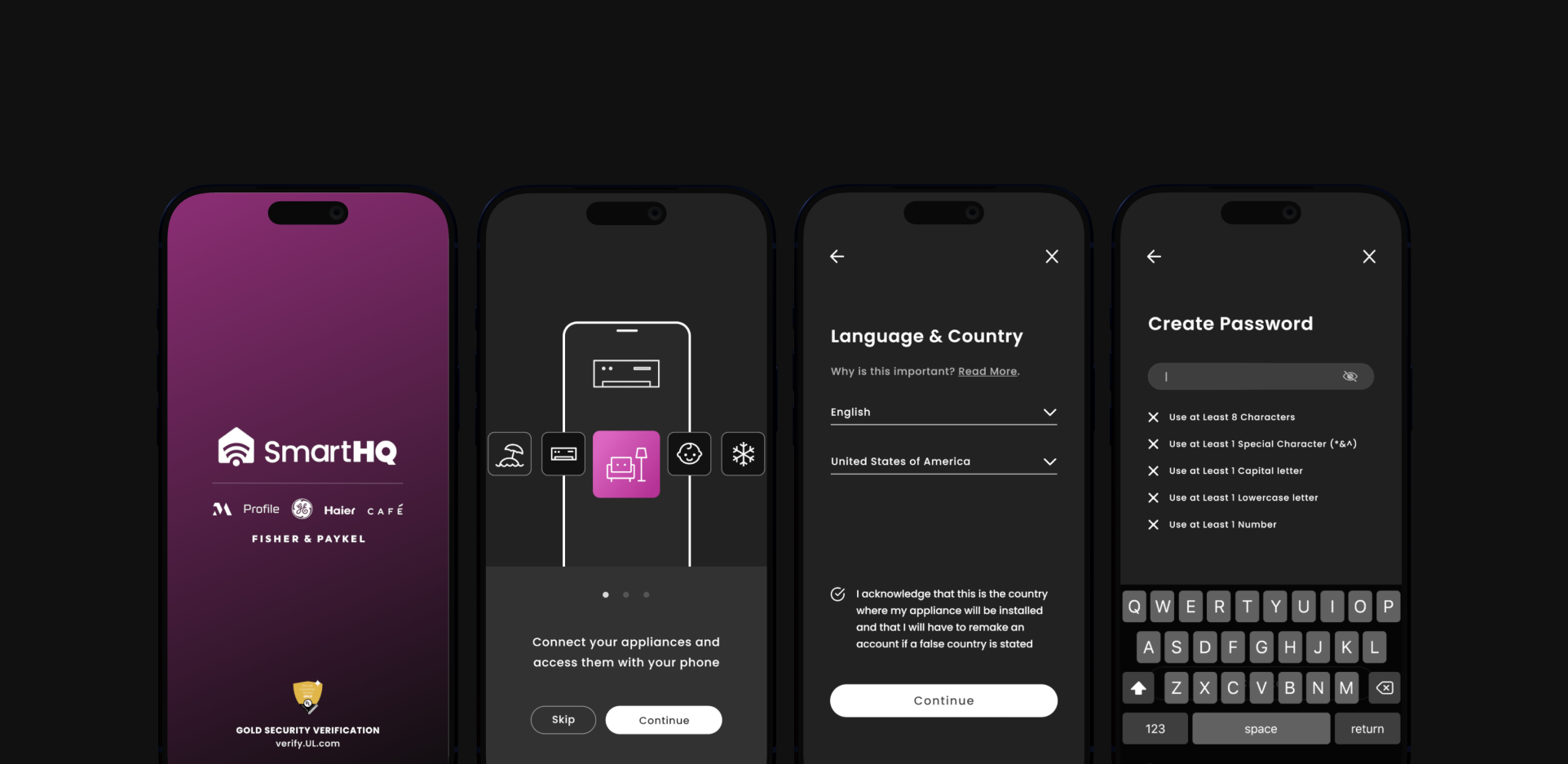
I proposed a restructured onboarding flow designed to improve clarity, reduce perceived friction, and establish trust earlier in the experience. Mid- to high-fidelity wireframes were used to demonstrate how these changes could improve comprehension without requiring a full system overhaul.
Key design decisions included:
- Grouping related selections such as language and country into a single, logical step.
- Introducing clearer explanatory copy before any personal data requests.
- Moving optional or advanced service information to post-login moments.
- Simplifying layouts to improve scannability and accessibility.
- Establishing clearer visual hierarchy through spacing, typography, and contrast.
Scroll Story
©2025 timothy yue li · all rights reserved · timyueli@gmail.com
Last Updated: 2025