This rebuild is still fresh. For now, please only view the desktop version.
Prior to this initiative, SmartHQ and ROUX relied on loosely defined guidelines and fragmented documentation. Interfaces were built by different designers across teams, resulting in inconsistent spacing, typography, color usage, and interaction patterns. At enterprise scale, the issues below created friction not only for users, but also for designers and engineers attempting to ship reliably.
Key issues included:
- Lack of universal spacing, grid, and layout standards.
- Inconsistent component behavior and visual hierarchy across screens.
- Accessibility gaps related to contrast, touch targets, and spacing.
- Confusing nomenclature and unclear design ownership.
- Developer uncertainty around what designs were finalized versus exploratory.
- Growing difficulty maintaining cohesion as new products and brands were added.
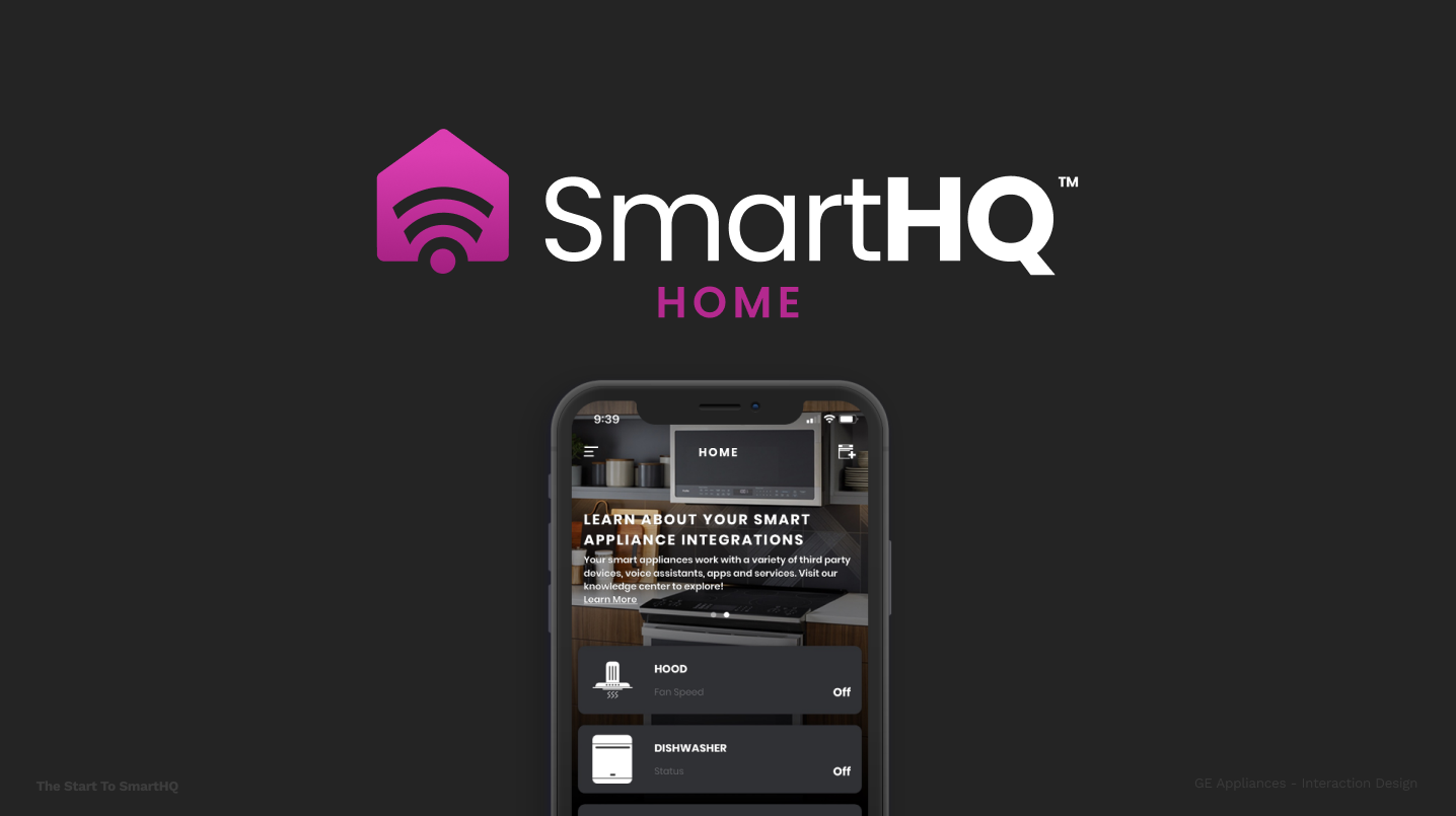
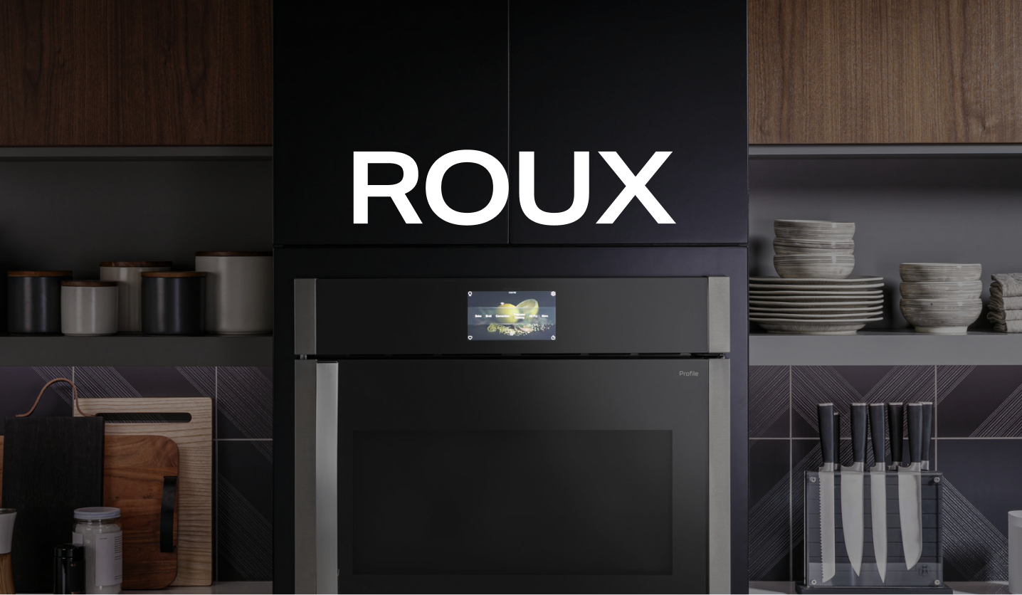
This effort was approached as a systems and communication problem rather than a visual refresh. The goal was to create shared foundations that could support multiple brands, platforms, and interaction contexts while remaining adaptable over time. The initiative was formalized as SmartHQ Design System 2.0, with parallel exploration and documentation work supporting ROUX and future tokenization strategies.
The work emphasized:
- Defining clear structural rules before refining aesthetics.
- Treating accessibility as a baseline requirement rather than an add-on.
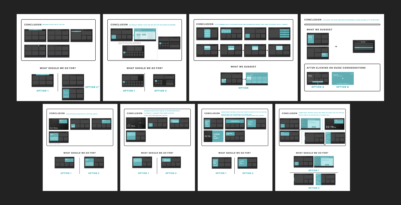
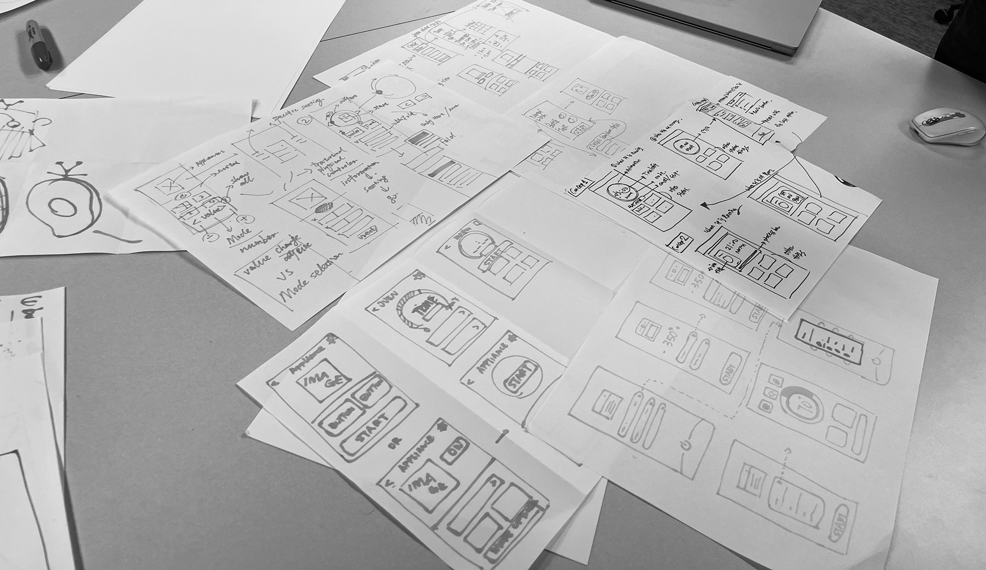
- Using low-fidelity artifacts intentionally to signal standards and intent to engineering.
- Designing rules and patterns that could scale across both mobile and embedded interfaces.
The outcome of this work was a more structured, accessible, and scalable design system spanning SmartHQ and ROUX. Rather than attempting a full replacement, the systems were designed to evolve incrementally alongside shipped products.
Key contributions included:
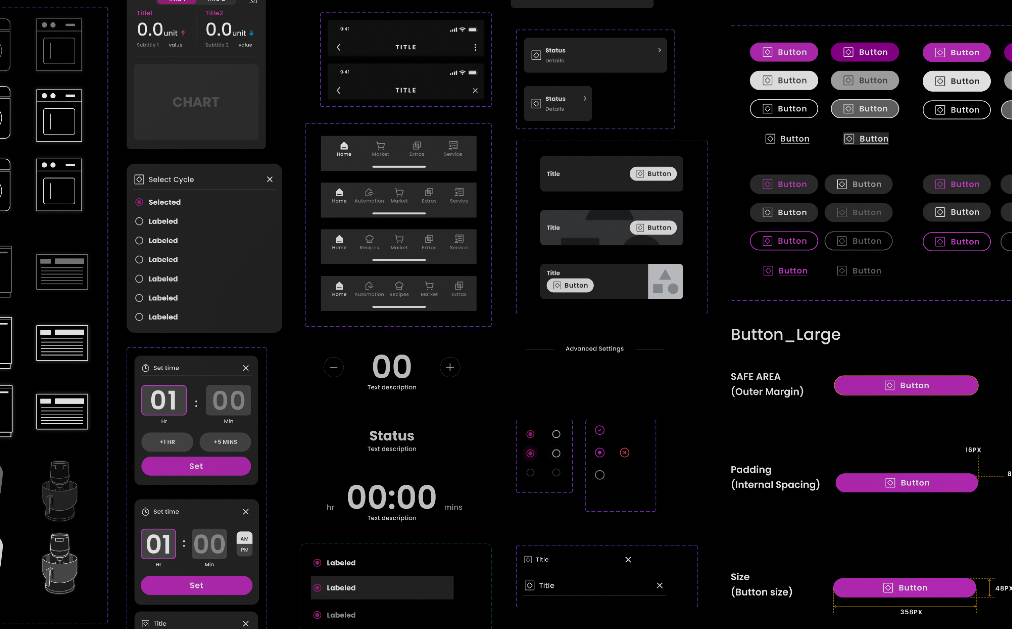
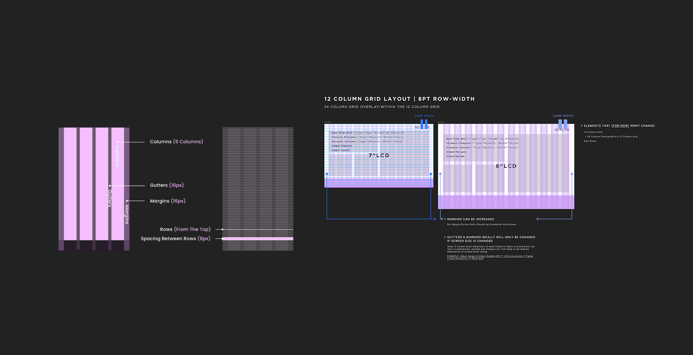
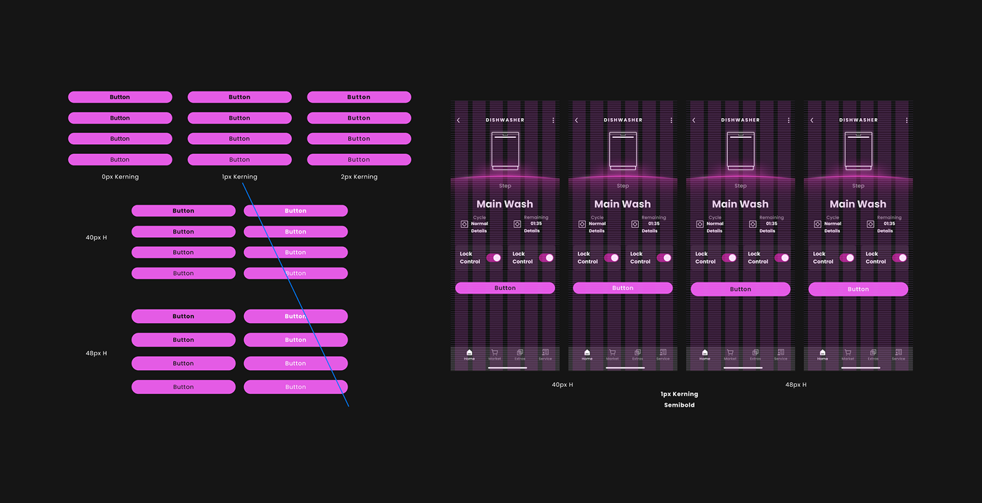
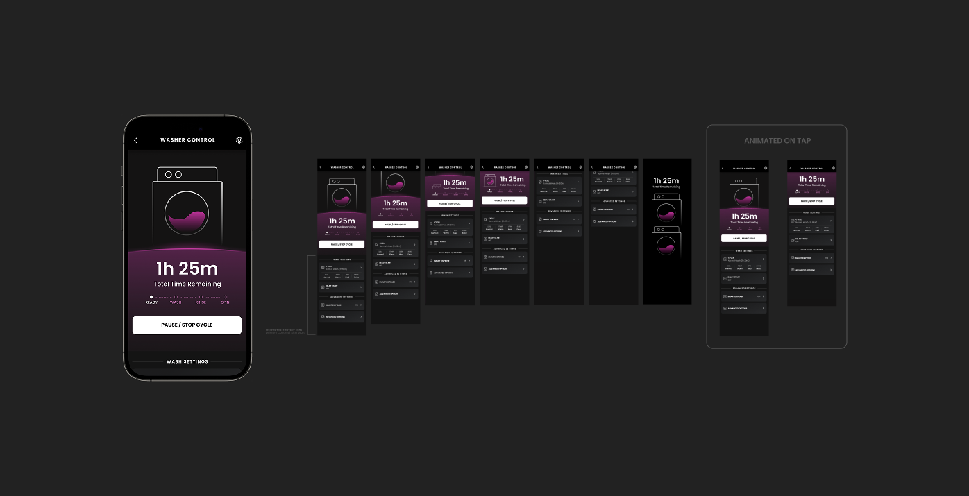
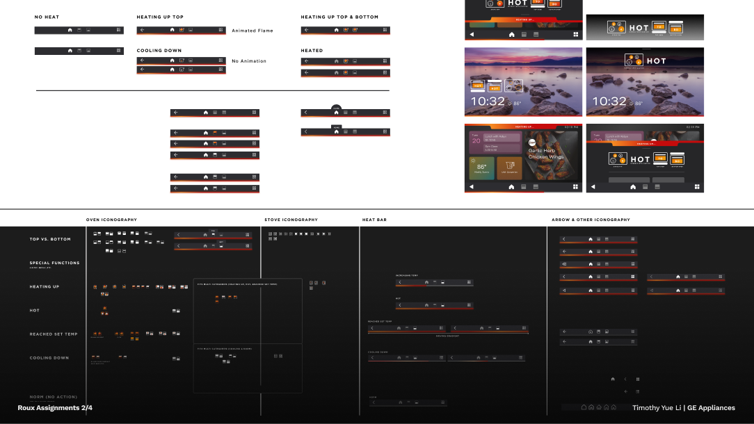
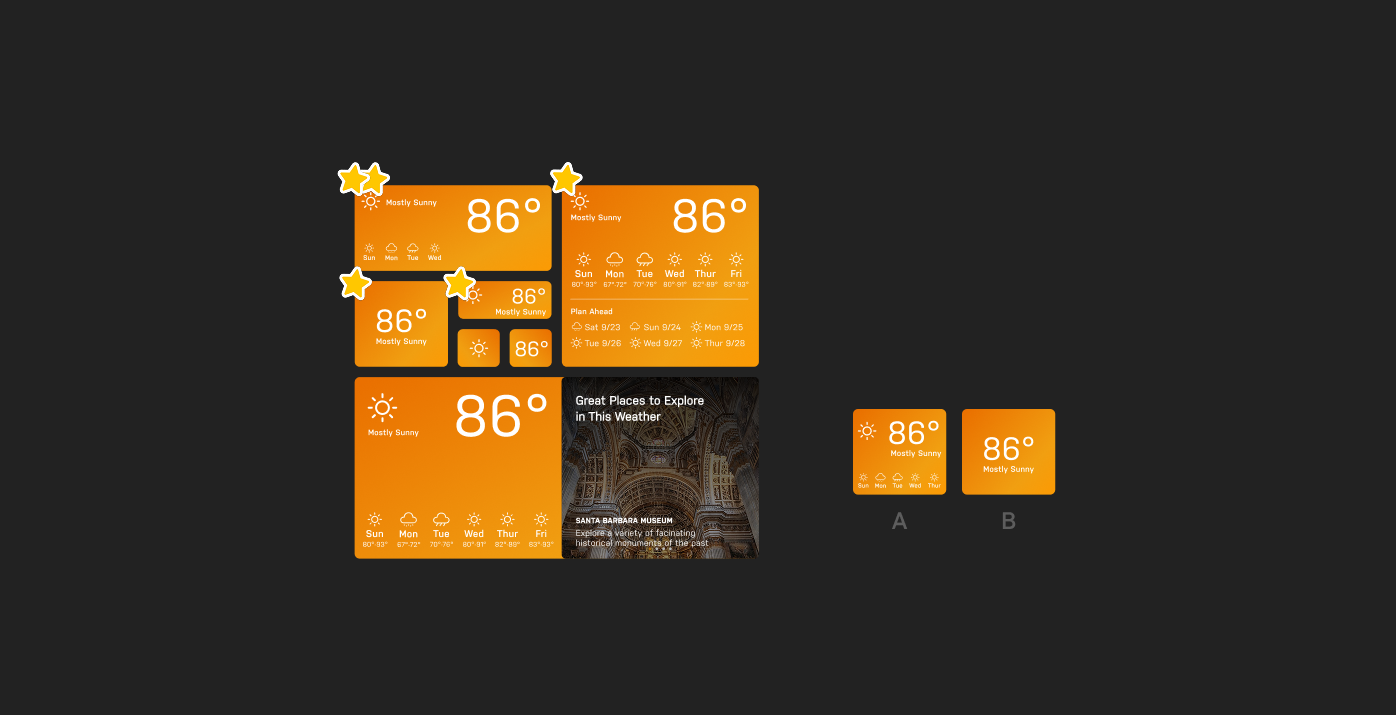
- Redesigning the grid system to support consistent layout across screens and devices.
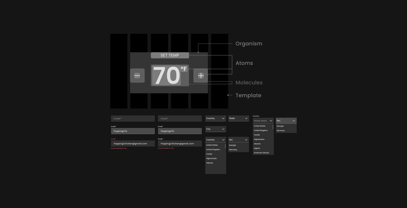
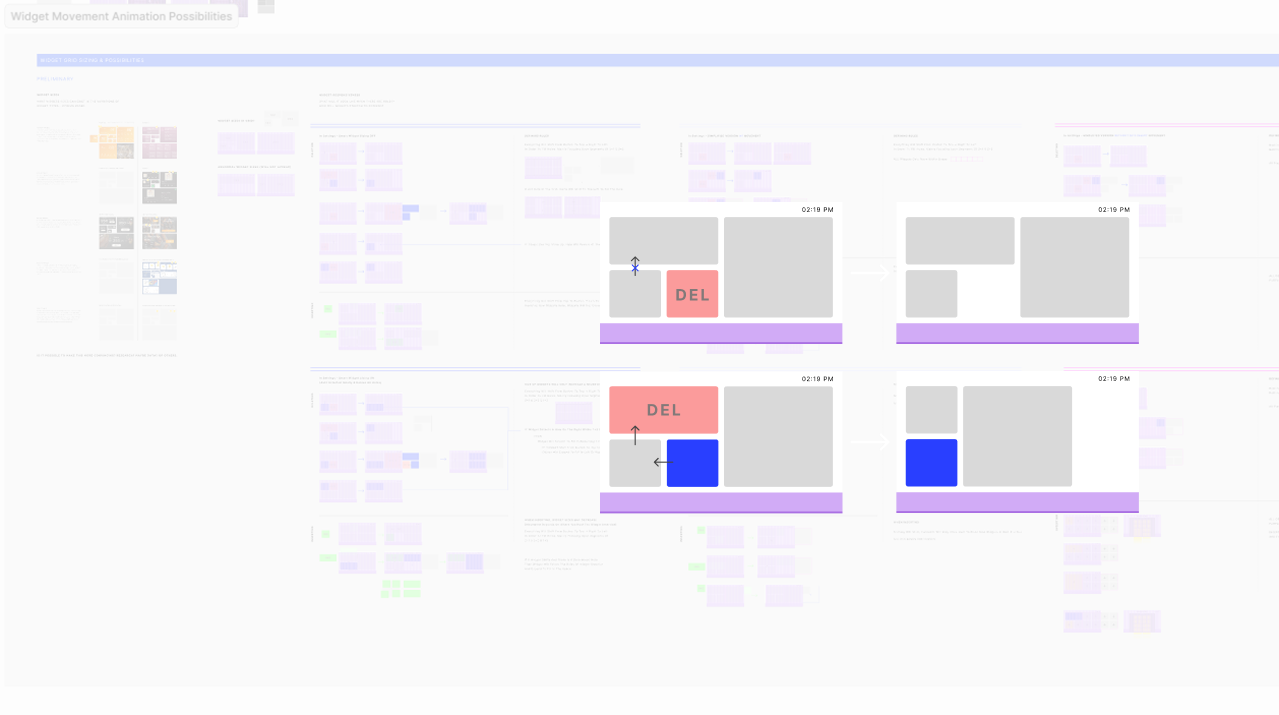
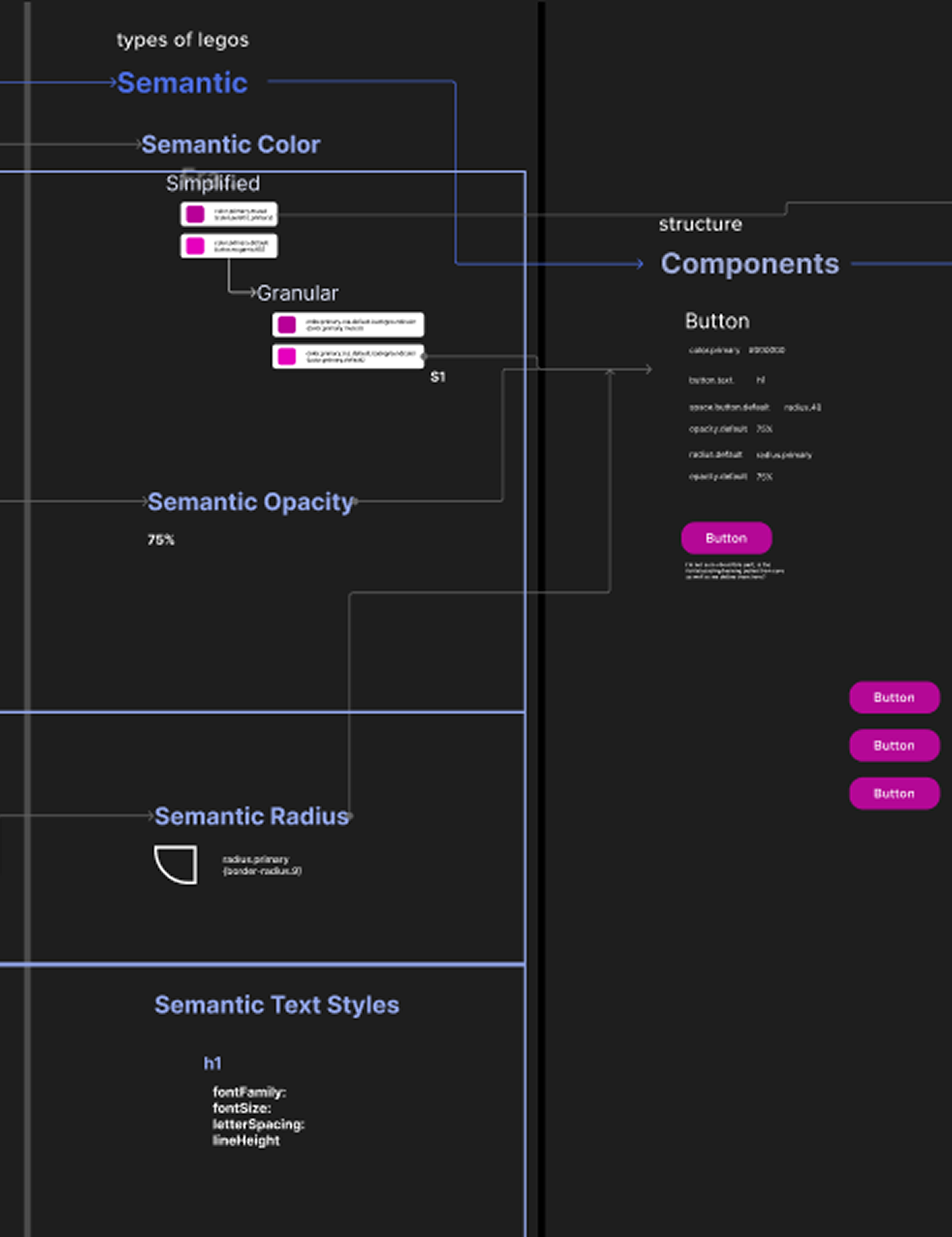
- Creating and documenting reusable components using atomic design principles.
- Establishing accessibility standards for spacing, typography, contrast, and touch zones.
- Auditing and refining iconography, radii, and component spacing for consistency.
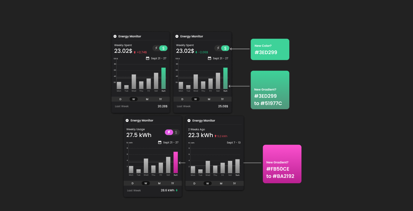
- Supporting early tokenization research to enable multi-brand theming without duplicating logic.
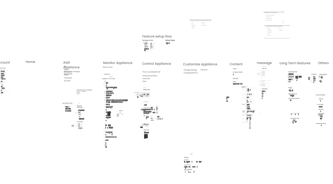
- Organizing and documenting over one thousand existing screens to identify and correct systemic issues.
Scroll Story
©2025 timothy yue li · all rights reserved · timyueli@gmail.com
Last Updated: 2025